Translating a Growing SaaS Platform into a Single Diagram
The Bigtincan platform diagram had a translation job: take a SaaS product that kept growing through acquisitions and product launches, and explain it in one image that buyers, investors, and internal teams could all read. I owned the diagram across two evolutions, art directing each round to keep pace with the product's expanding capabilities and the brand's refreshed visual system. The diagram became Bigtincan's primary visual shorthand for the platform across the website, investor materials, and sales decks.
 Bigtincan • New York, N.Y.
 Art Director, Graphic Designer, Project Manager
 Illustrator
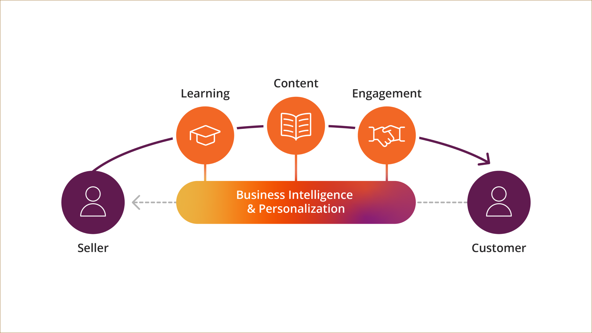
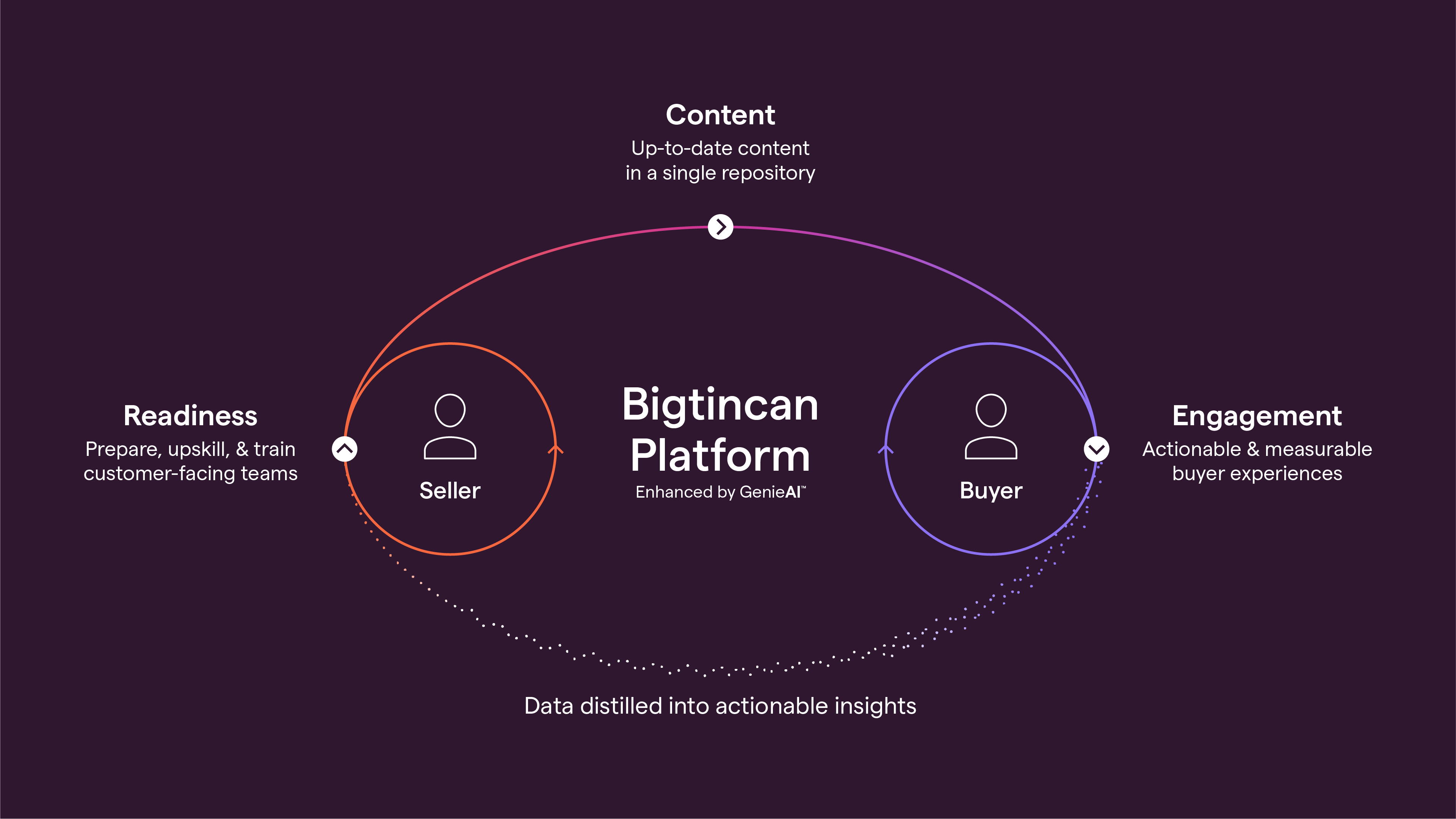
Original ➺ Final
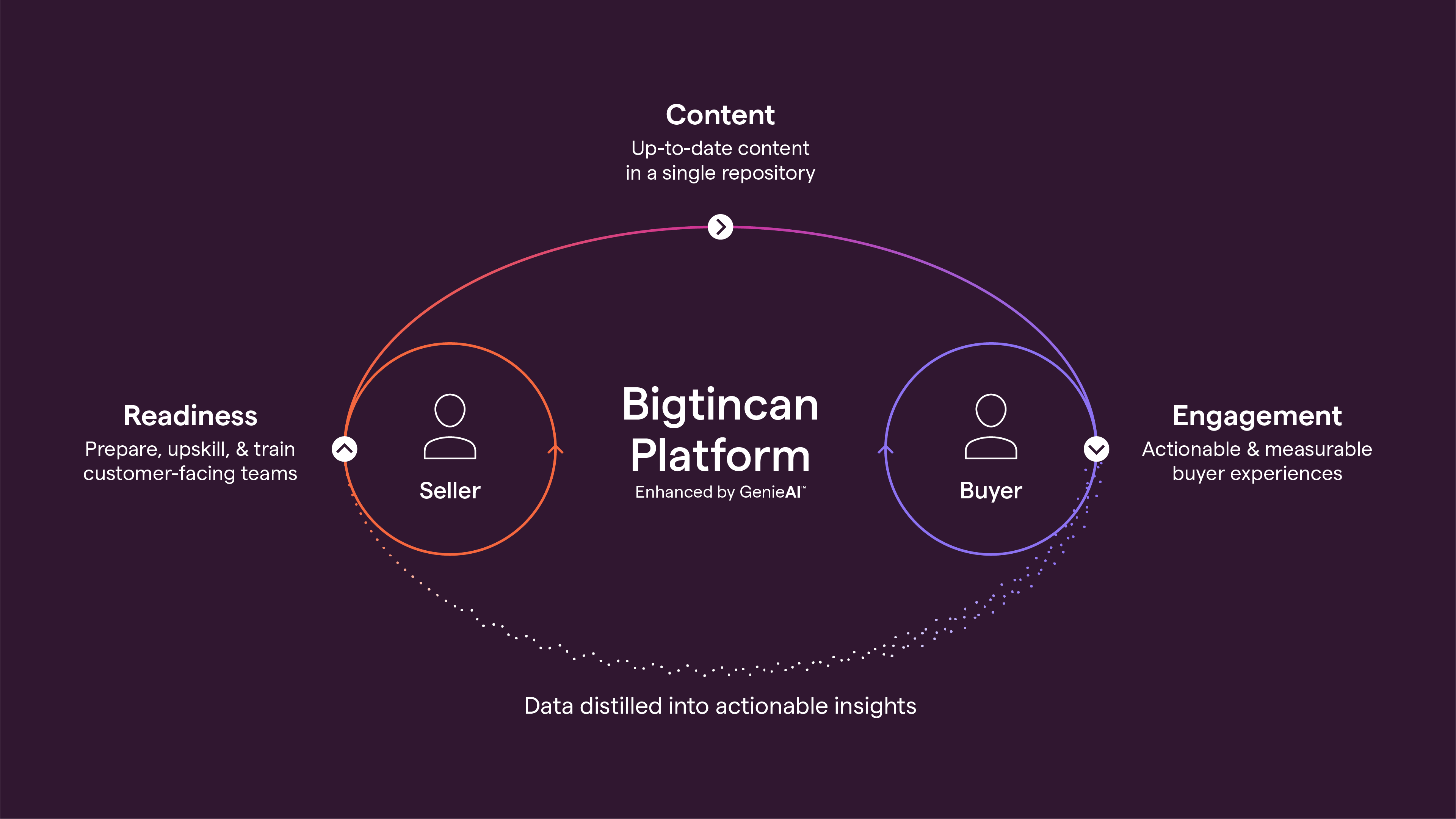
Three states of the platform diagram, art directed across two redesigns. The original predates the brand refresh; the reimagined version landed during the rebrand; the final state reflects the platform's continued growth. The first round was designed by Claire Rosas under my art direction.
Original
Reimagined
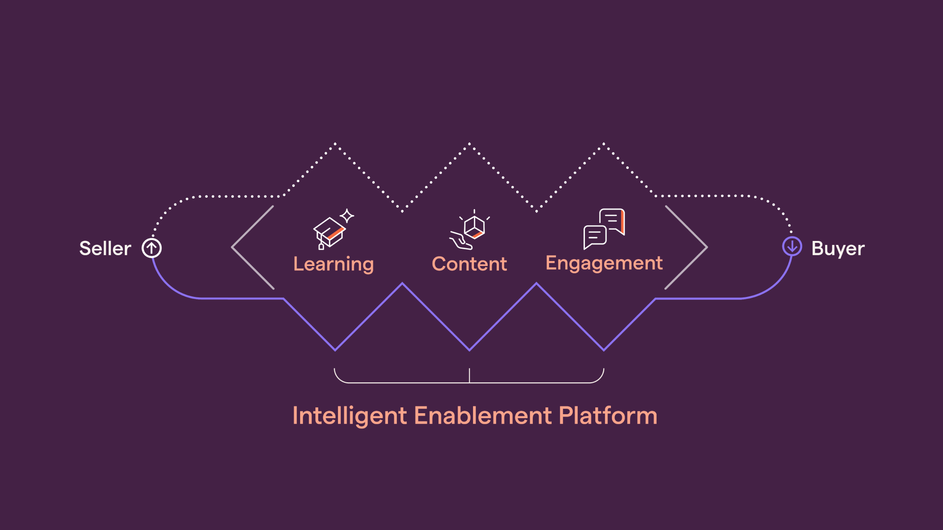
Final
Other Projects

OpenAIExec & Product Comms • Presentations • Events
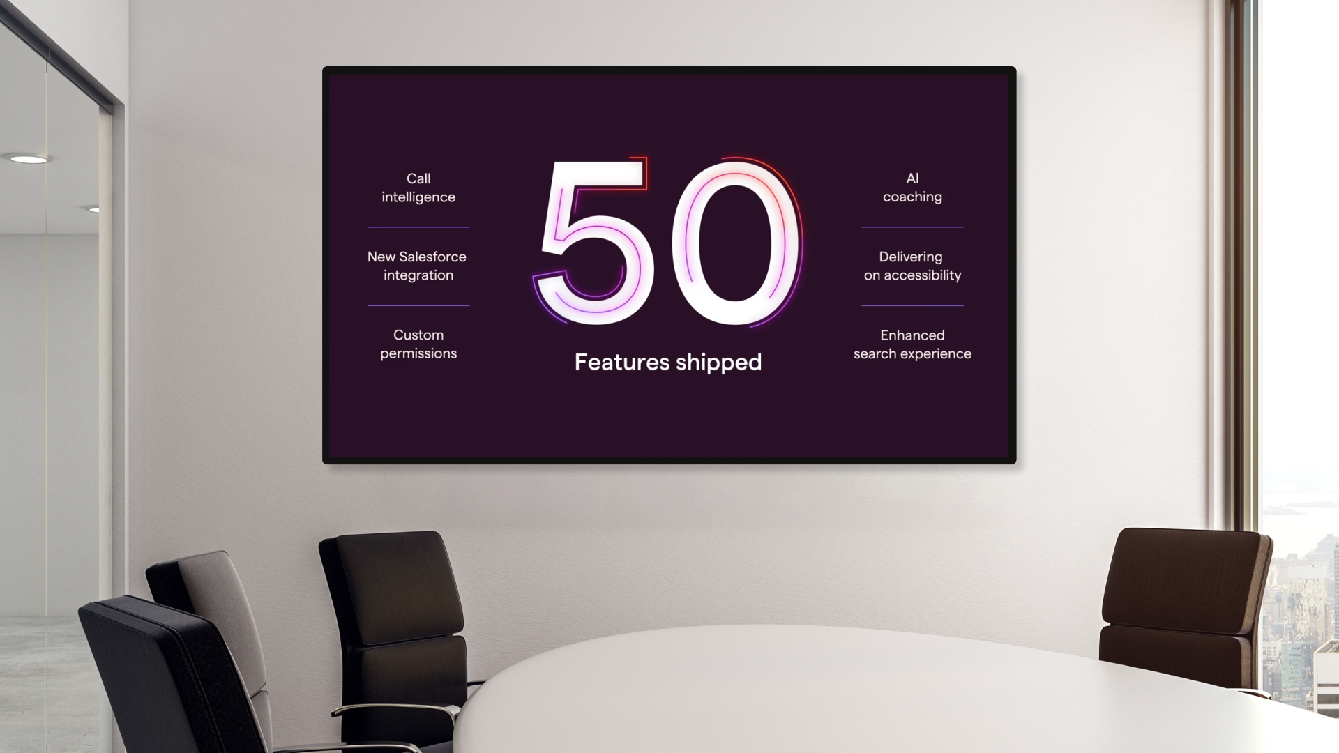
Bigtincan Investor Product & Tech DayEvent • Product & Investor Comms

SS&CCorporate & Investor Comms • Visual Identity

RipplingCorporate & Product Comms • Presentation

Teambridge AI Sub-BrandVisual Identity • Web Design
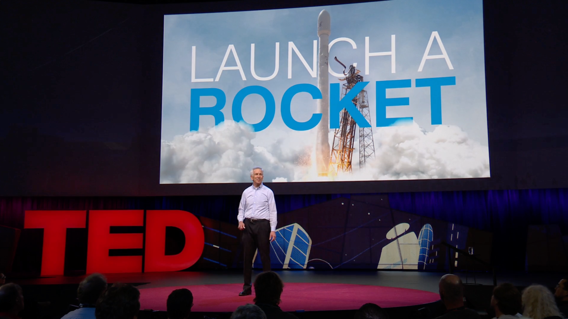
Environmental Defense Fund TED TalkEvent • Presentation
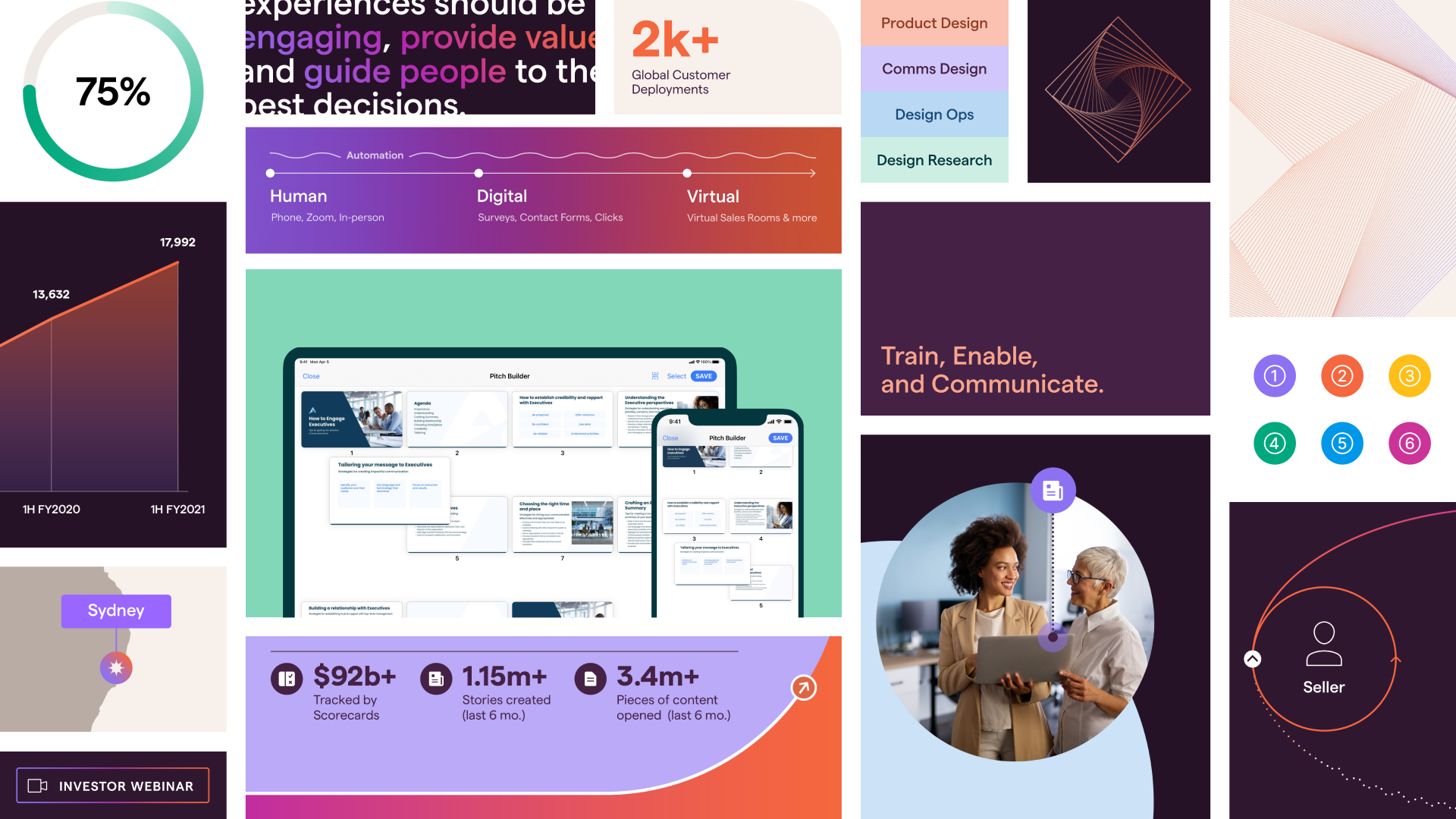
Bigtincan Visual IdentityVisual Identity • Product, Investor & Corporate Comms

MonarchProduct Comms • Marketing

RitualProduct & Investor Comms • Marketing

ScholasticCorporate & Investor Comms • Presentation
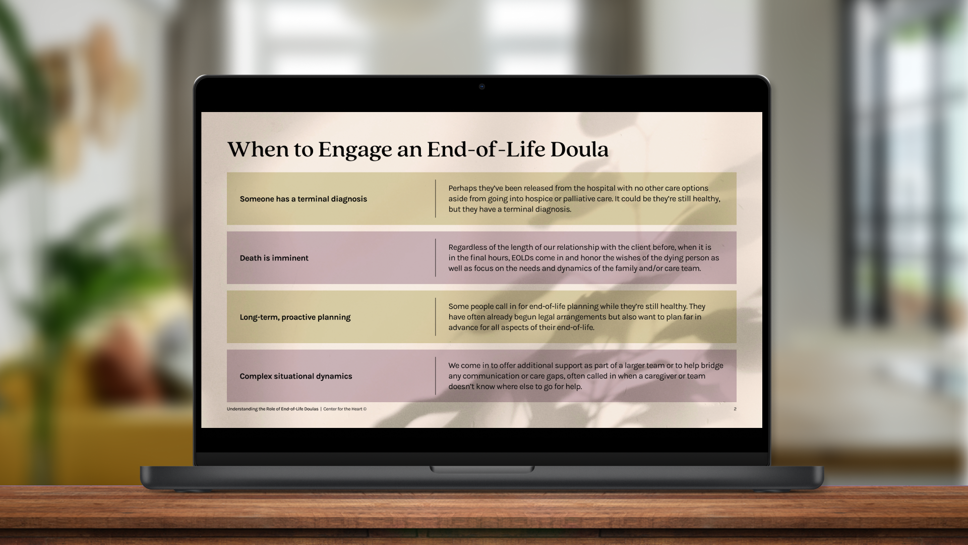
Center for the Heart Visual Identity BasicsVisual Identity • NPO Comms

MetamorphosisVisual Identity • Microsite • Social Media
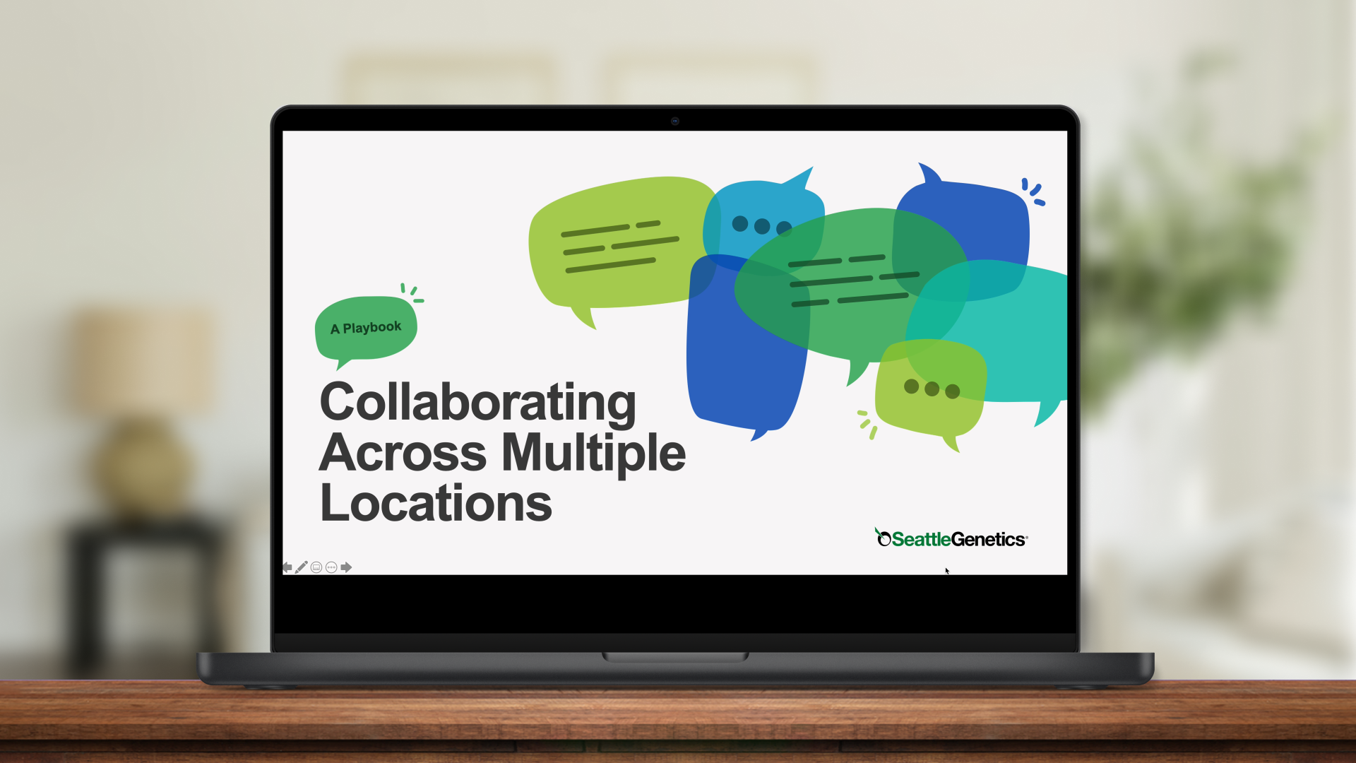
Seagen Multi-Location Collaboration PlaybookCorporate Comms • Presentation

© Danielle Morris 2026