
A Visual Identity for End-of-Life and Loss Care
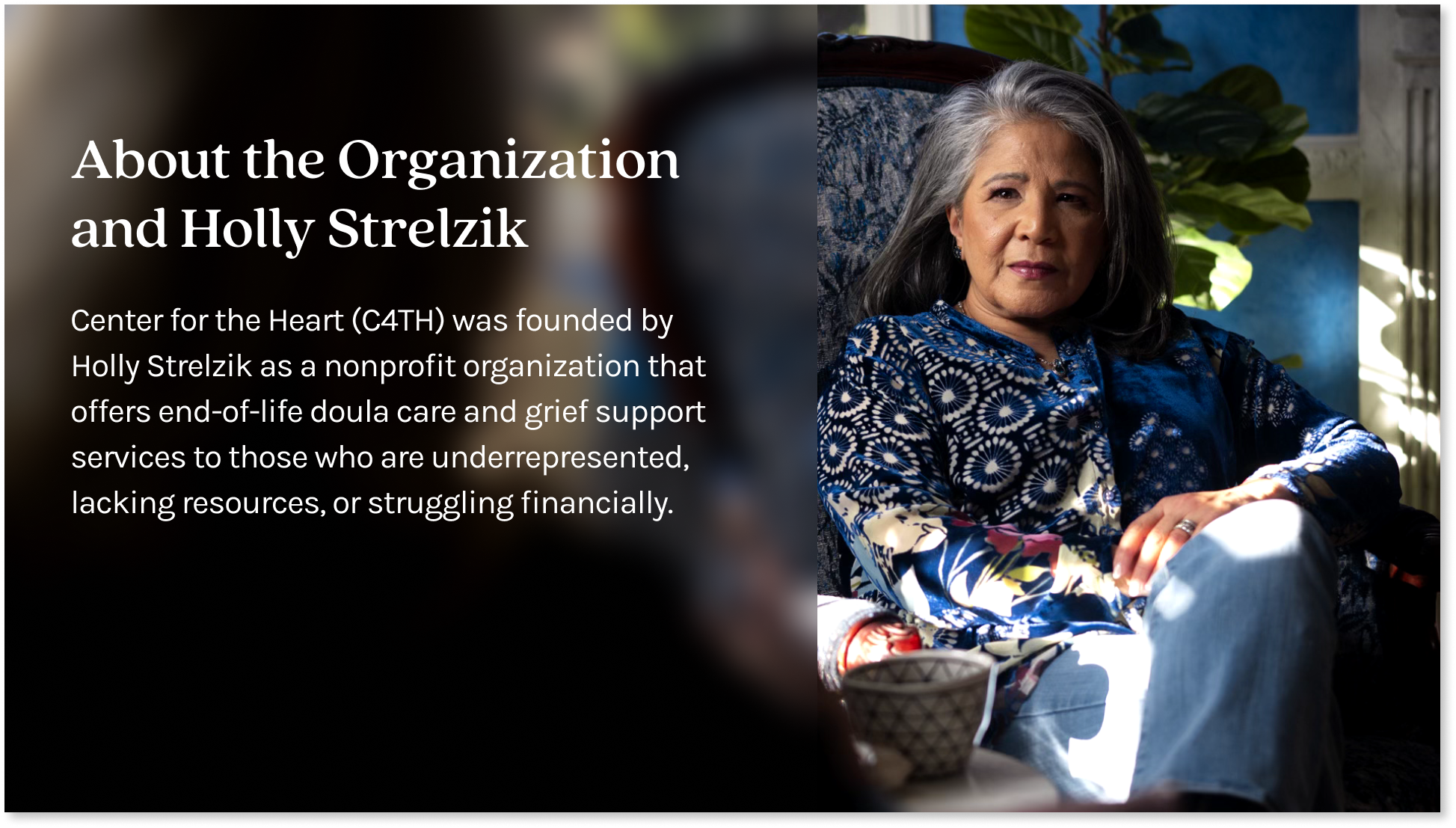
Center for the Heart is a NJ-based nonprofit working to make compassionate, grief-informed end-of-life care accessible regardless of income or life circumstances. I designed their visual identity foundation, including logo, typography, color, imagery, and the rationale behind each, to give a small, growing organization a credible, warm visual presence in a category that doesn't have many peers to look to for inspiration.
 Center for the Heart Non-Profit 501(c)(3)
 Creative Strategist, Graphic Designer
Context
The org's mission is to serve people regardless of income or life circumstances, which means the brand has to do more than communicate compassion. It has to read as credible and trustworthy to donors, healthcare partners, and grieving families on first contact, in a category where most design either over-softens with generic warmth or over-clinicalizes into medical sterility.
Objective
Build a visual foundation that reads as warm and trustworthy without leaning on grief-design clichés. The system had to feel professional enough to instill donor and partner confidence, and human enough to comfort someone arriving in a hard moment.
Solution
A complete identity foundation: logo, typography, color, imagery direction, graphic elements, and the rationale documenting each choice. The system was designed to scale with the organization as it grows, and to give the small team a clear visual language they could apply themselves without needing a designer in the room for every decision.
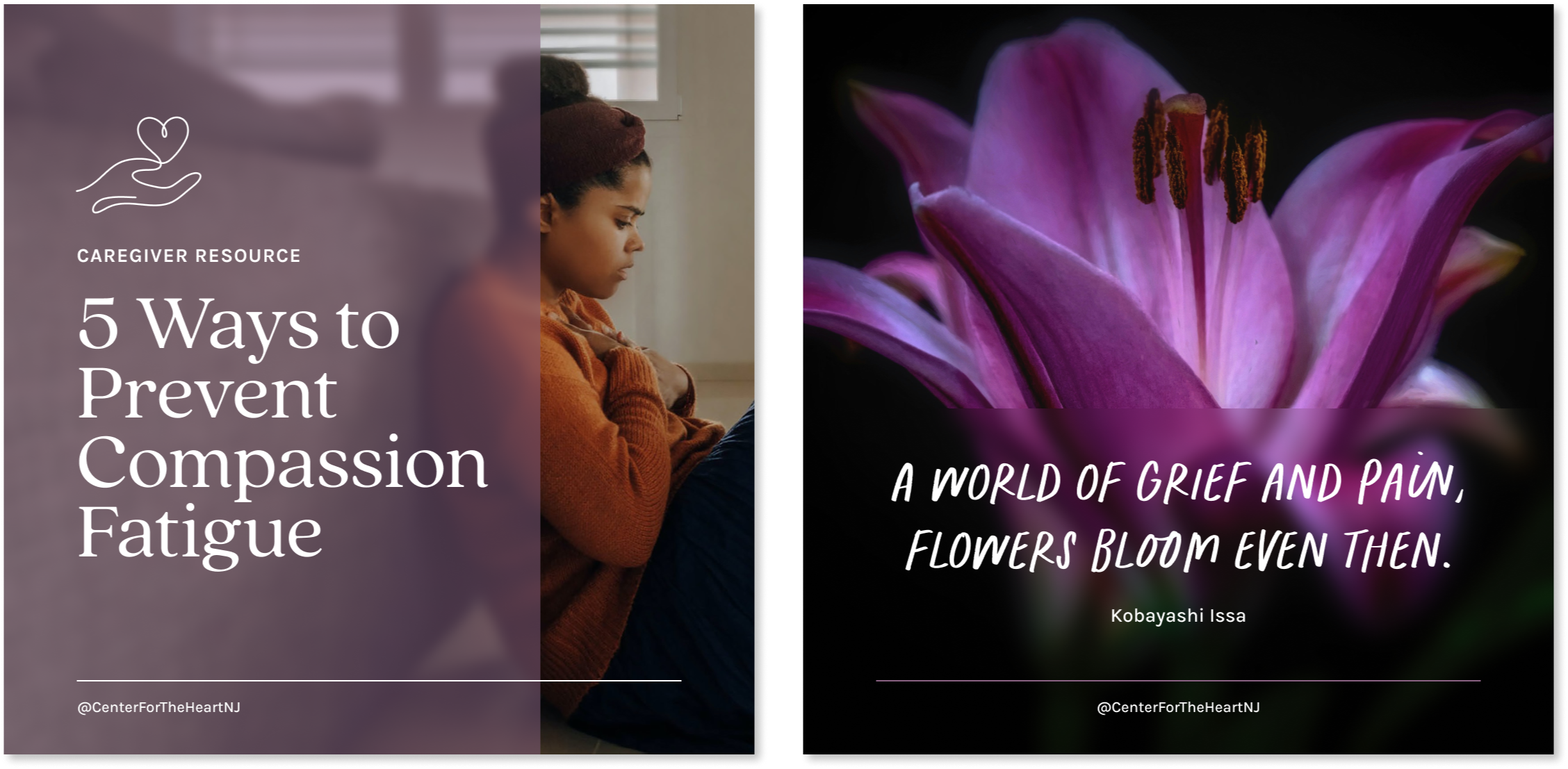
Inspired by the form of the 'C' in the typeface, the logo visually represents C4TH's dedication to holding your heart with care. It utilizes a continuous line style to symbolize the enduring nature of love despite loss and our interconnectedness.

The typefaces are friendly, sophisticated and versatile.

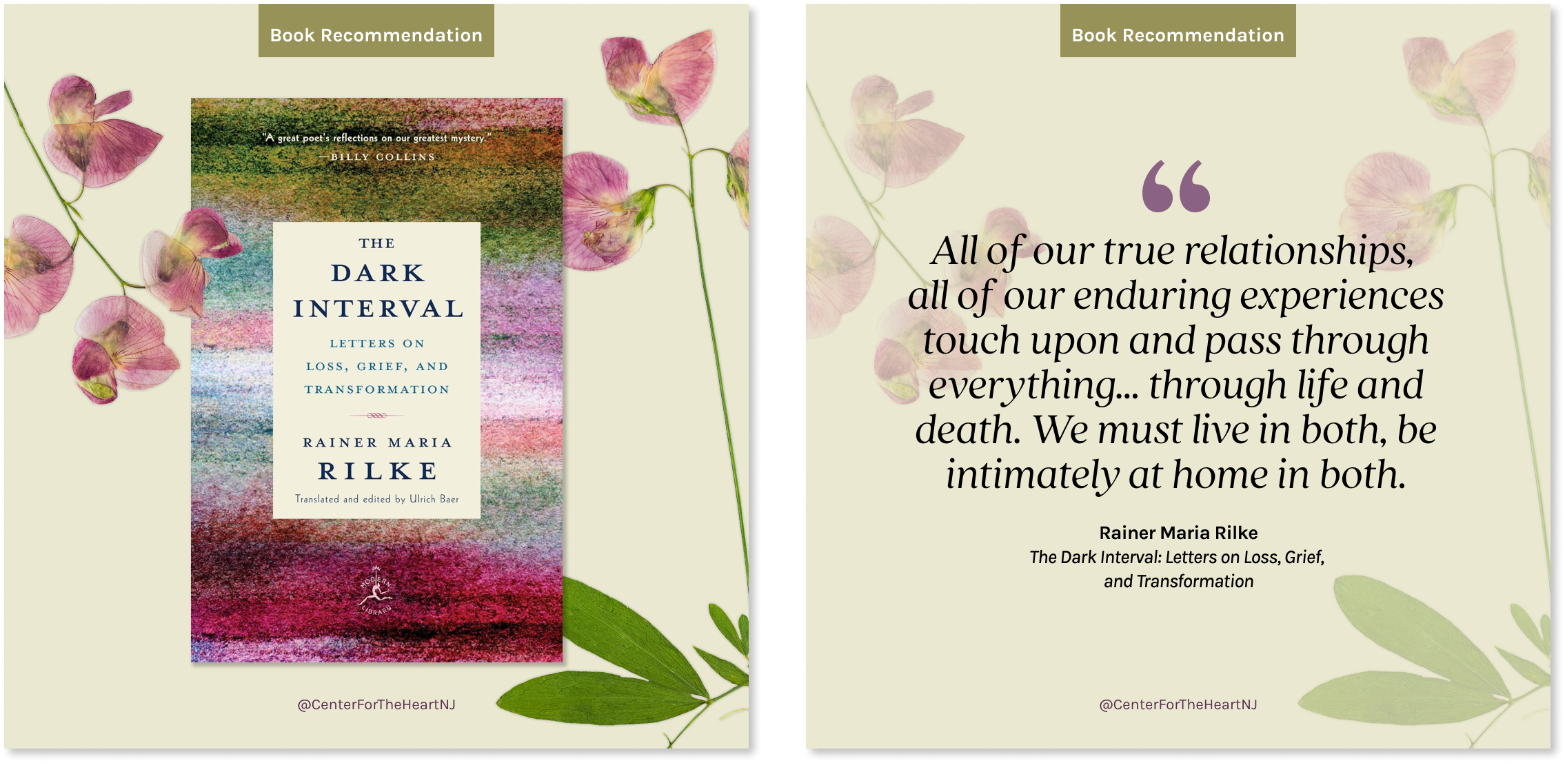
Pressed flowers symbolize both the transience of life and the enduring beauty that transcends death itself.

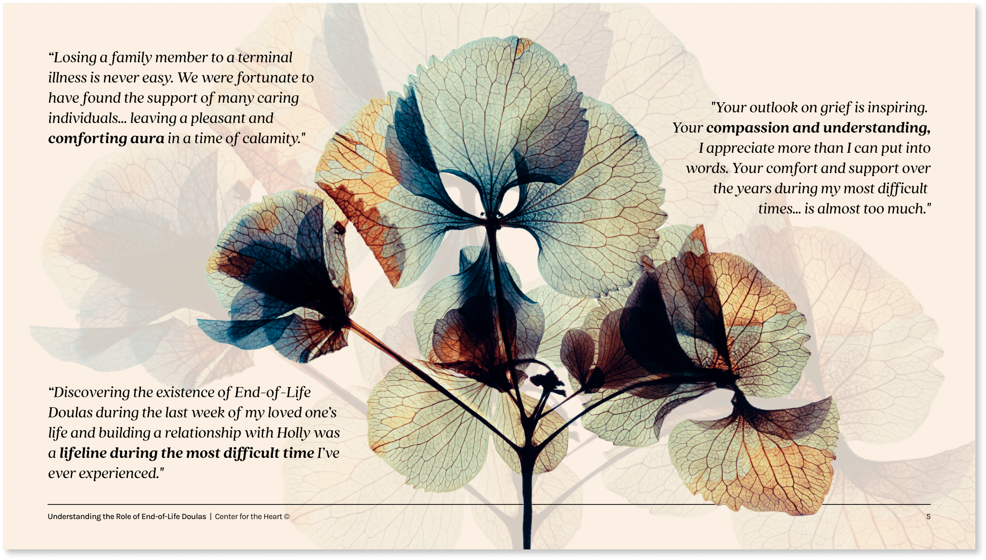
The color palette is rooted in earth tones to create a calming and welcoming look and feel.

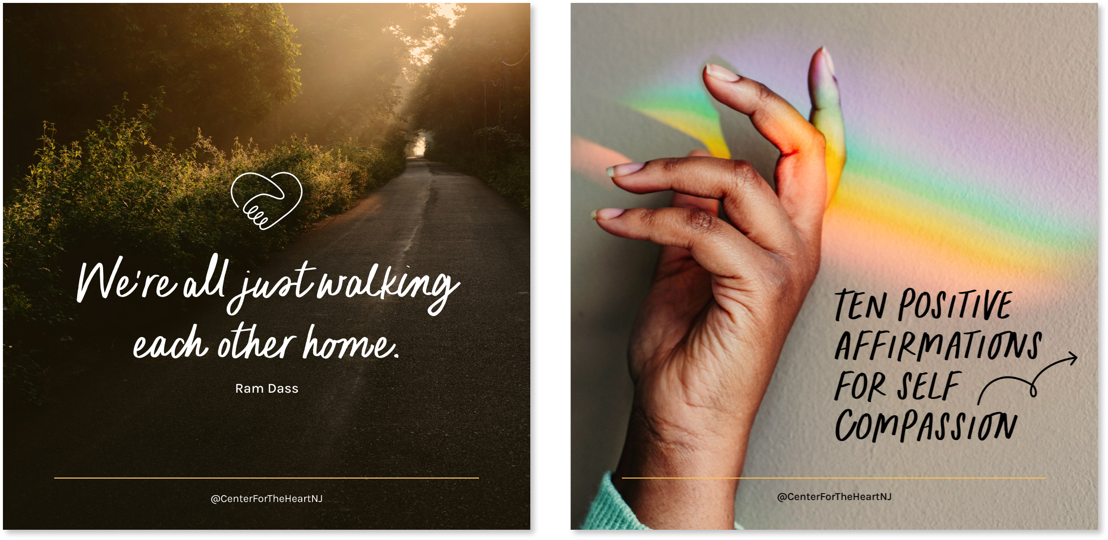
Graphic elements in a hand-drawn style used sparingly creates a friendly feel without looking childish.

Authentic imagery creates approachable visuals that invite intimacy and connection.
Other Projects

OpenAIProduct Comms • Presentations • Events
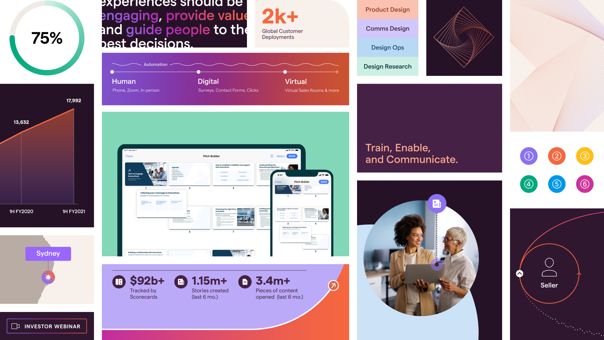
Bigtincan Investor Product & Tech DayEvent • Product & Investor Comms
SS&CCorporate & Investor Comms • Visual Identity

RipplingCorporate & Product Comms • Presentation

Teambridge AI Sub-BrandVisual Identity • Web Design
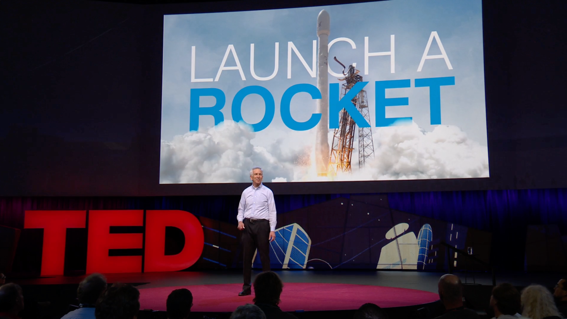
Environmental Defense Fund TED TalkEvent • Presentation
Bigtincan Visual IdentityVisual Identity • Product, Investor & Corporate Comms

MonarchProduct Comms • Marketing

RitualProduct & Investor Comms • Marketing
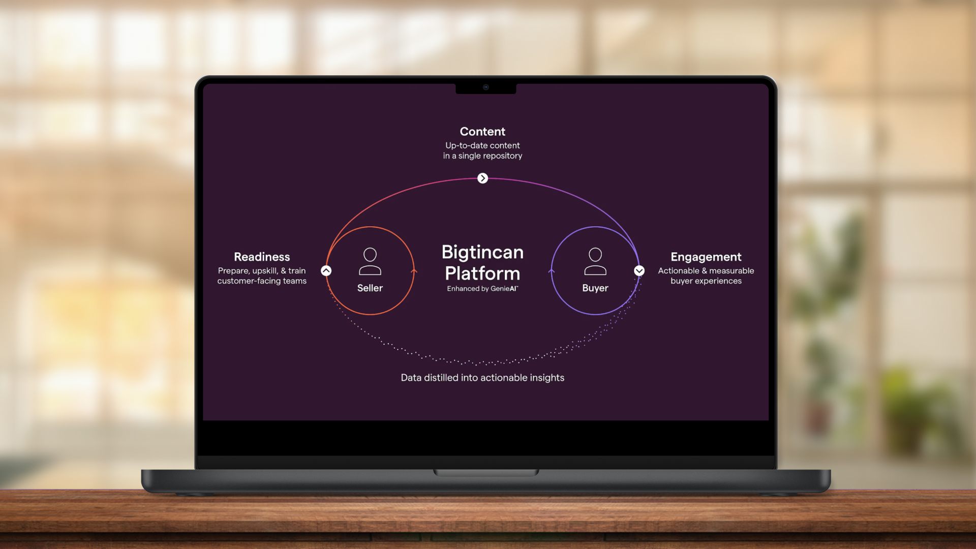
Bigtincan Platform DiagramInfo Visualization • Product Comms

ScholasticCorporate & Investor Comms • Presentation

MetamorphosisVisual Identity • Microsite • Social Media
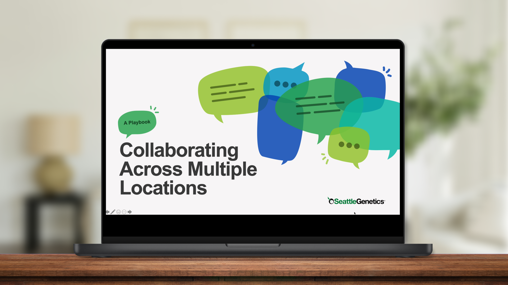
Seagen Multi-Location Collaboration PlaybookCorporate Comms • Presentation
© Danielle Morris 2026