Visual Identity Basics
A custom, sustainable visual identity foundation for a growing non-profit organization with a mission near and dear to my heart.
🏢 Center for the Heart Non-Profit 501(c)(3)
🎩 Creative Strategist, Designer
Context
About Center for the Heart
C4TH's mission is to empower people in navigating end-of-life and loss experiences with compassion. They need to instill trust in prospective clients and donors in order to broaden their scope to provide more and diverse support.
Objective
Trustworthy & Kind Visual Presence
An intentionally crafted visual identity foundation will convey C4TH's dedication to compassionate, professional grief and end-of-life care, building trust and support for those facing loss.
Solution
Visual Identity Basics
Foundational visual identity elements that ensure consistent communication across channels and support long-term scalability and adaptability to the organization's evolution.
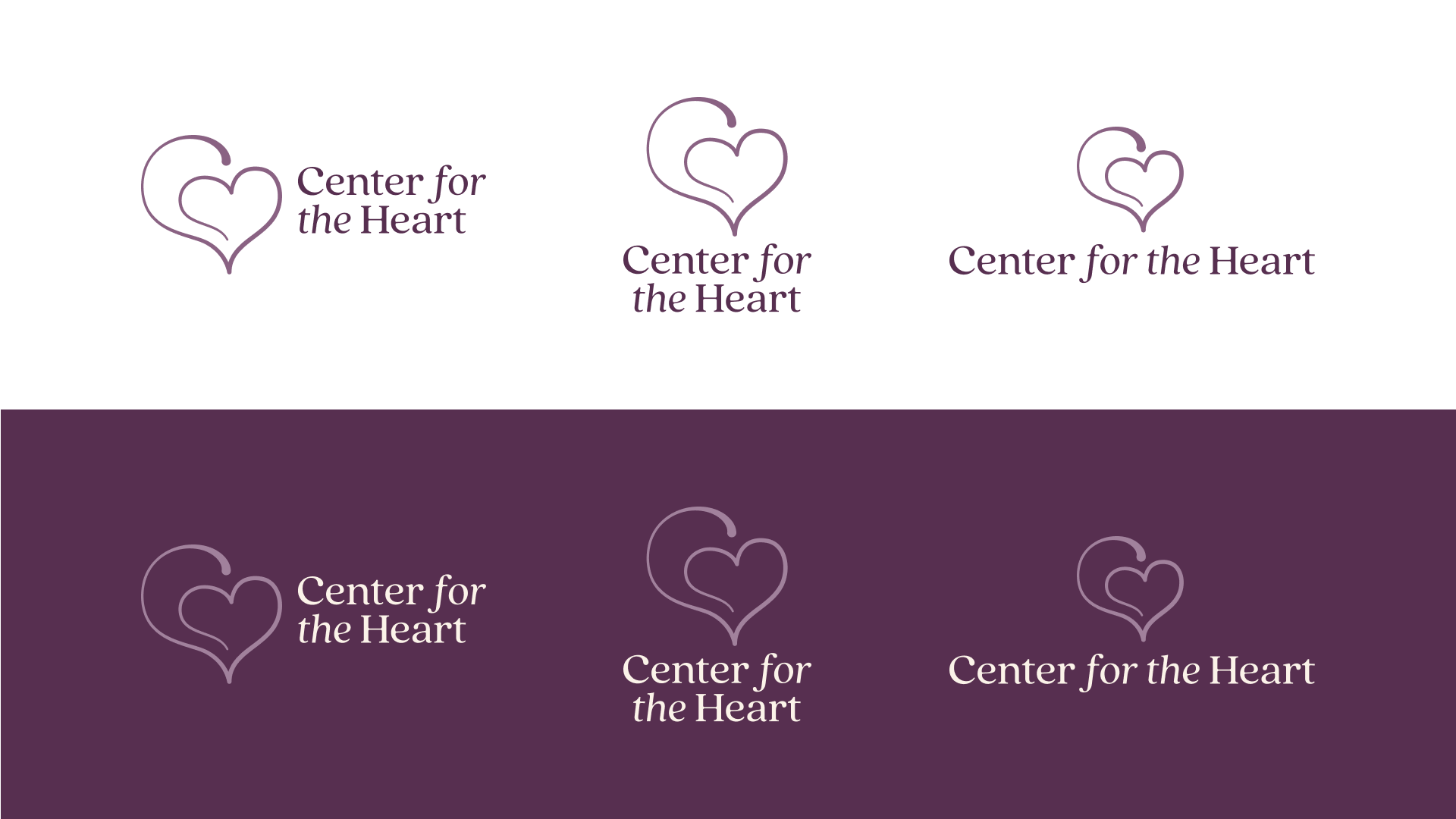
Inspired by the form of the 'C' in the typeface, the logo visually represents C4TH's dedication to holding your heart with care. It utilizes a continuous line style to symbolize the enduring nature of love despite loss and our interconnectedness.
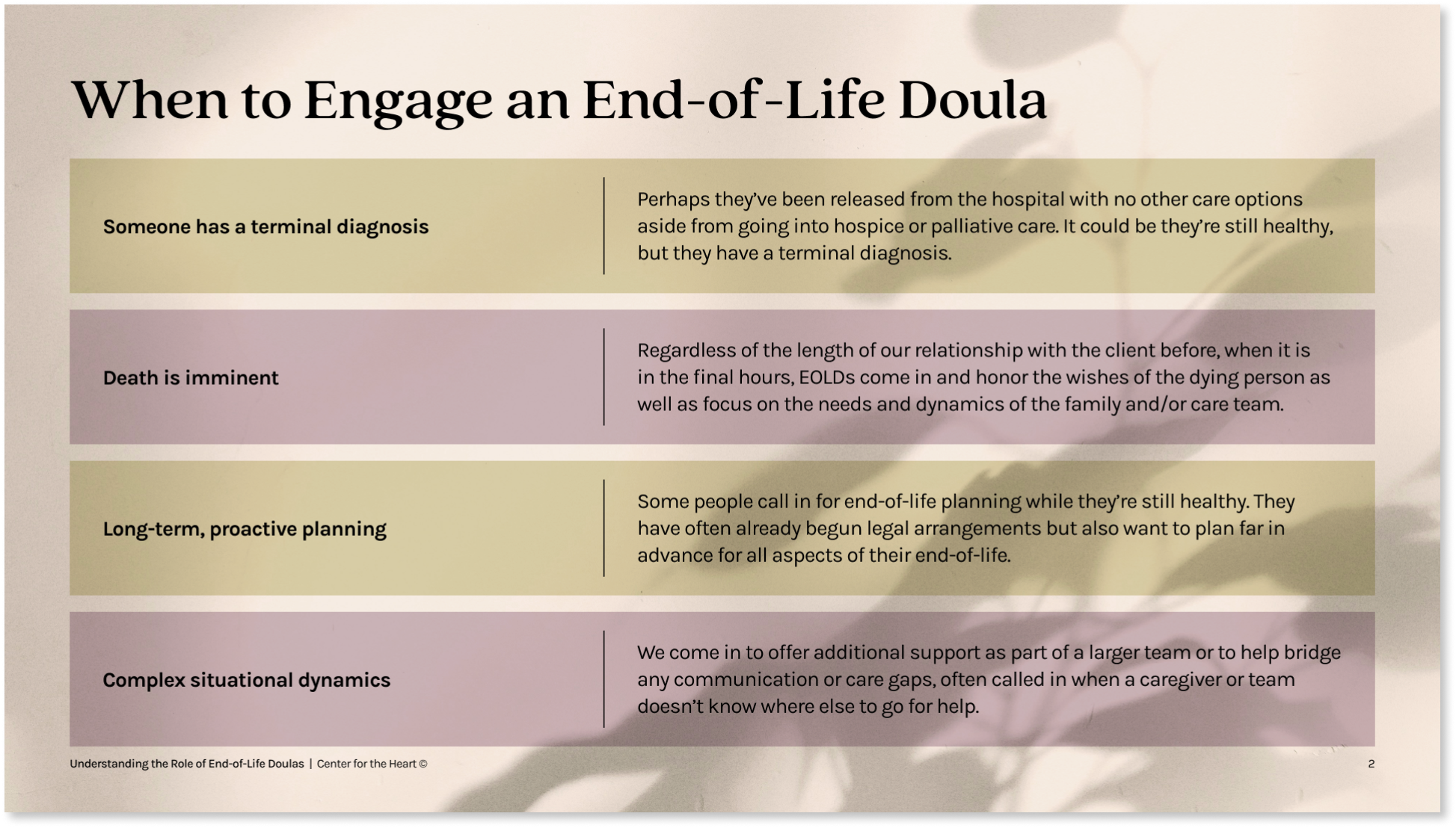
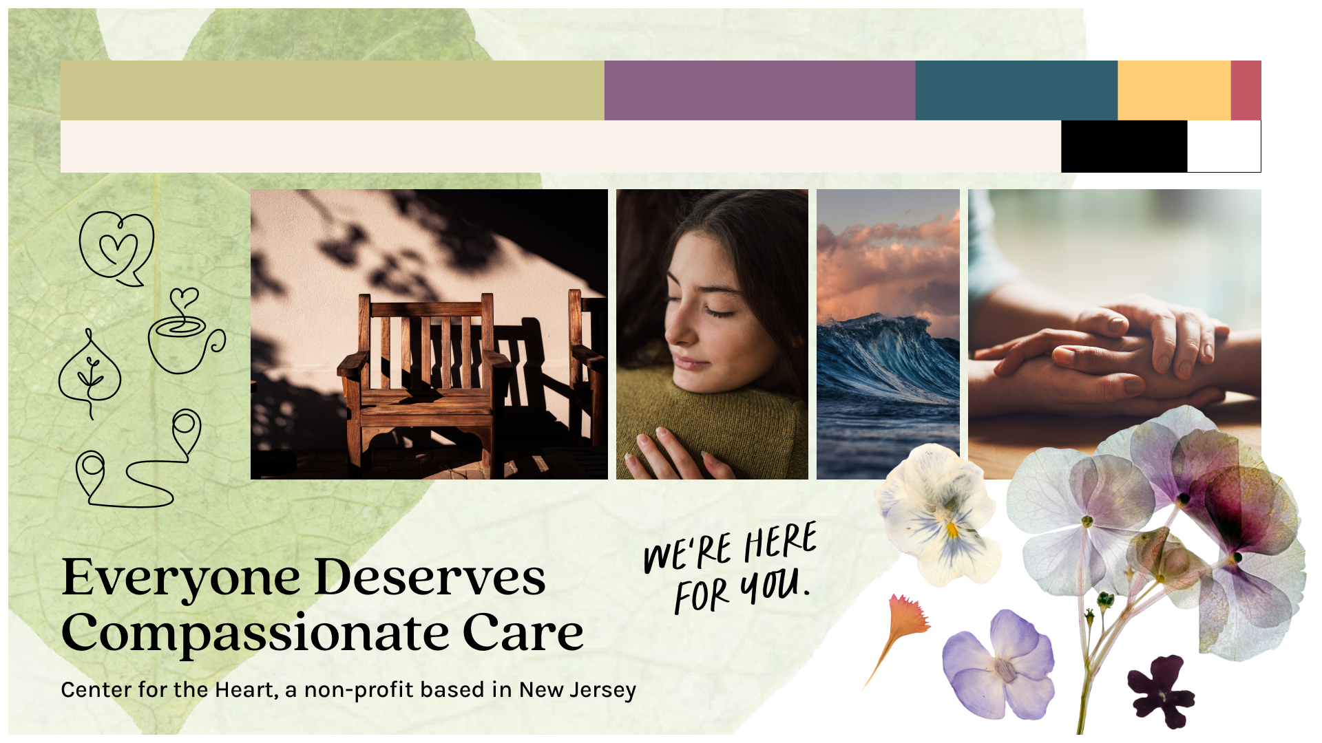
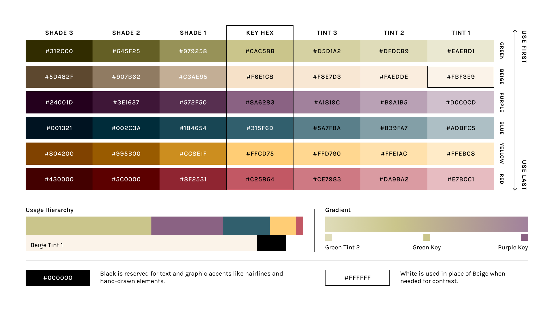
The color palette is rooted in earth tones to create a calming and welcoming look and feel.
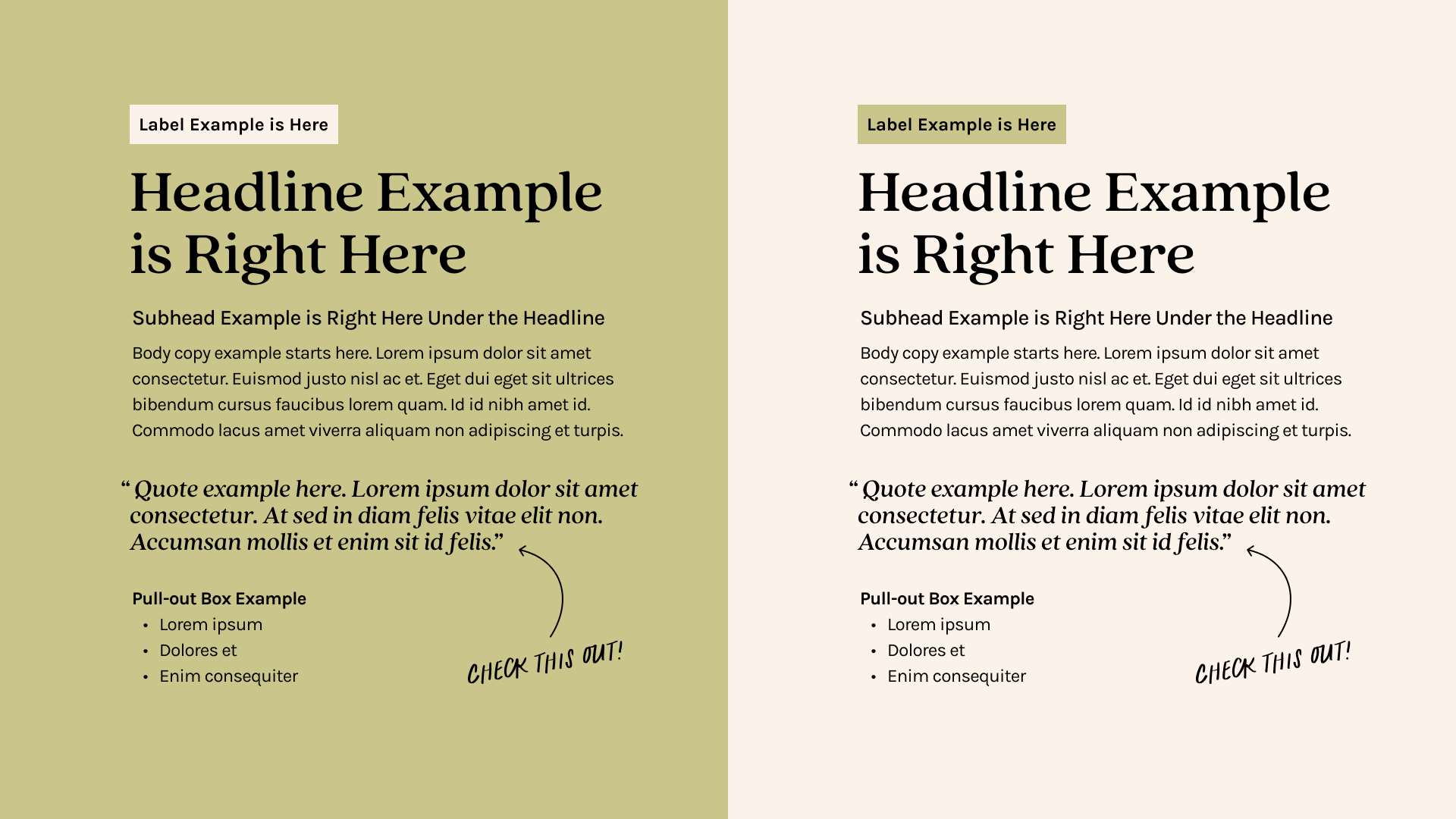
The typefaces are friendly, sophisticated, versatile, and affordable.
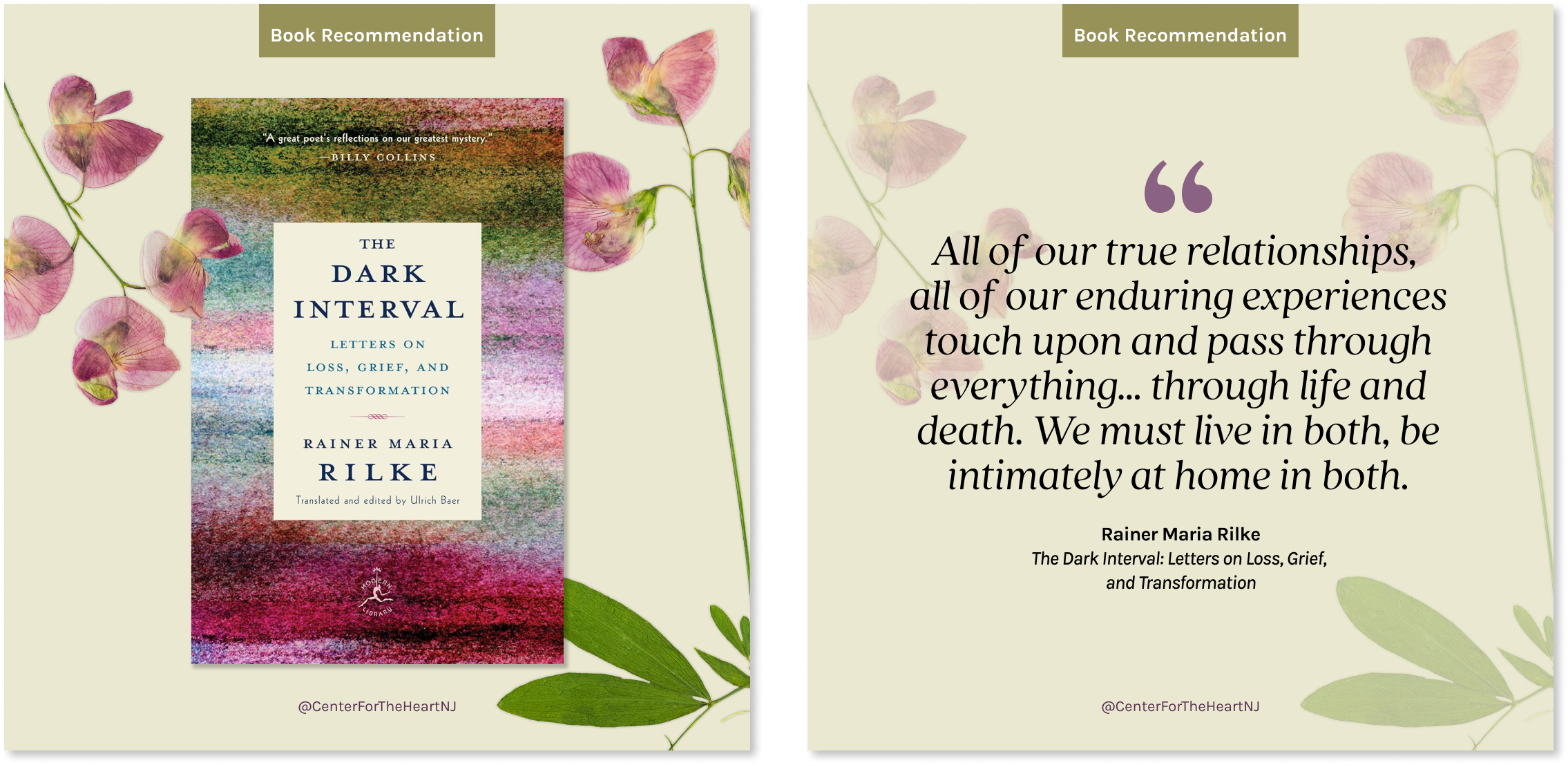
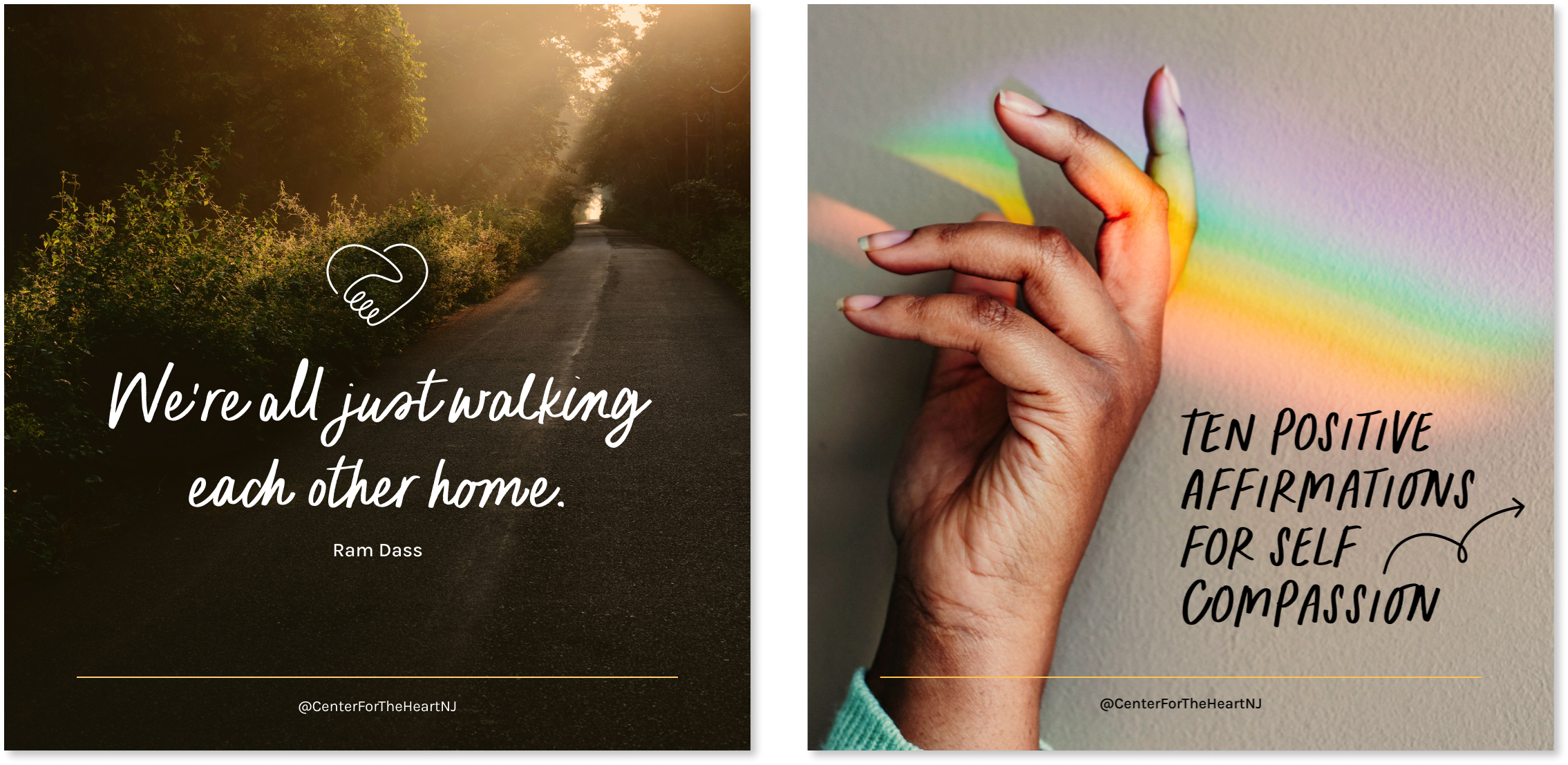
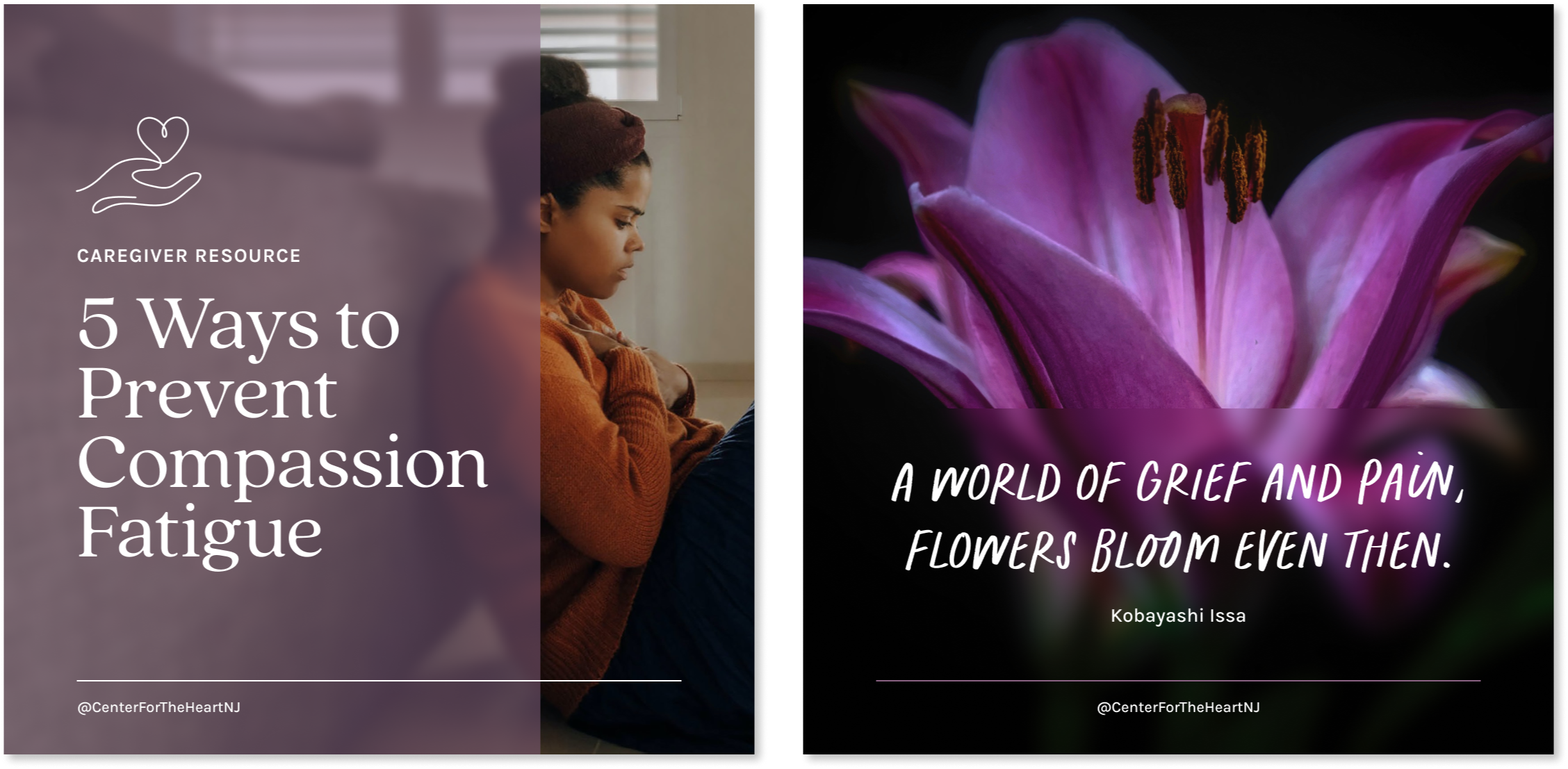
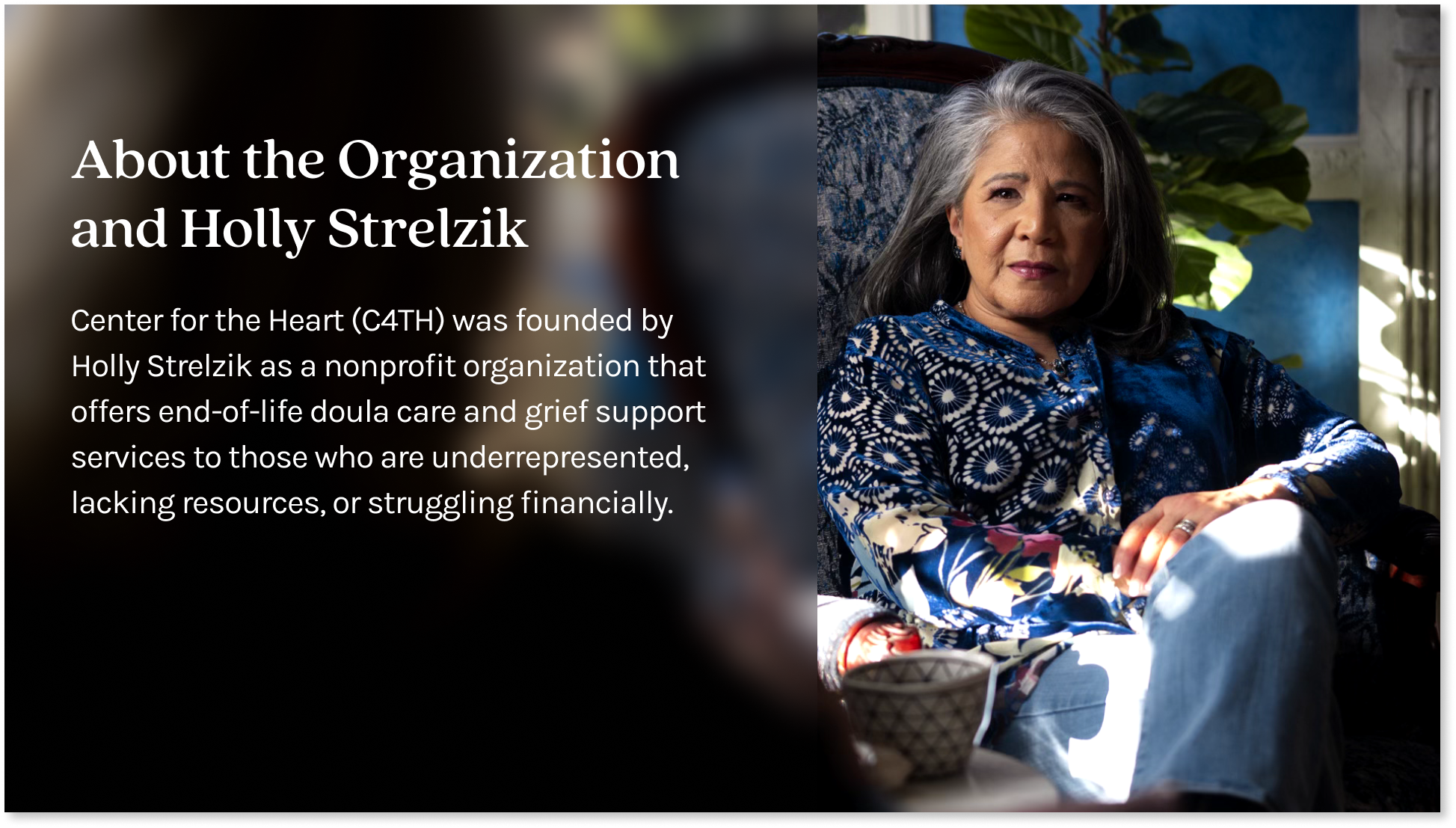
Authentic imagery creates approachable visuals that invite intimacy and connection.

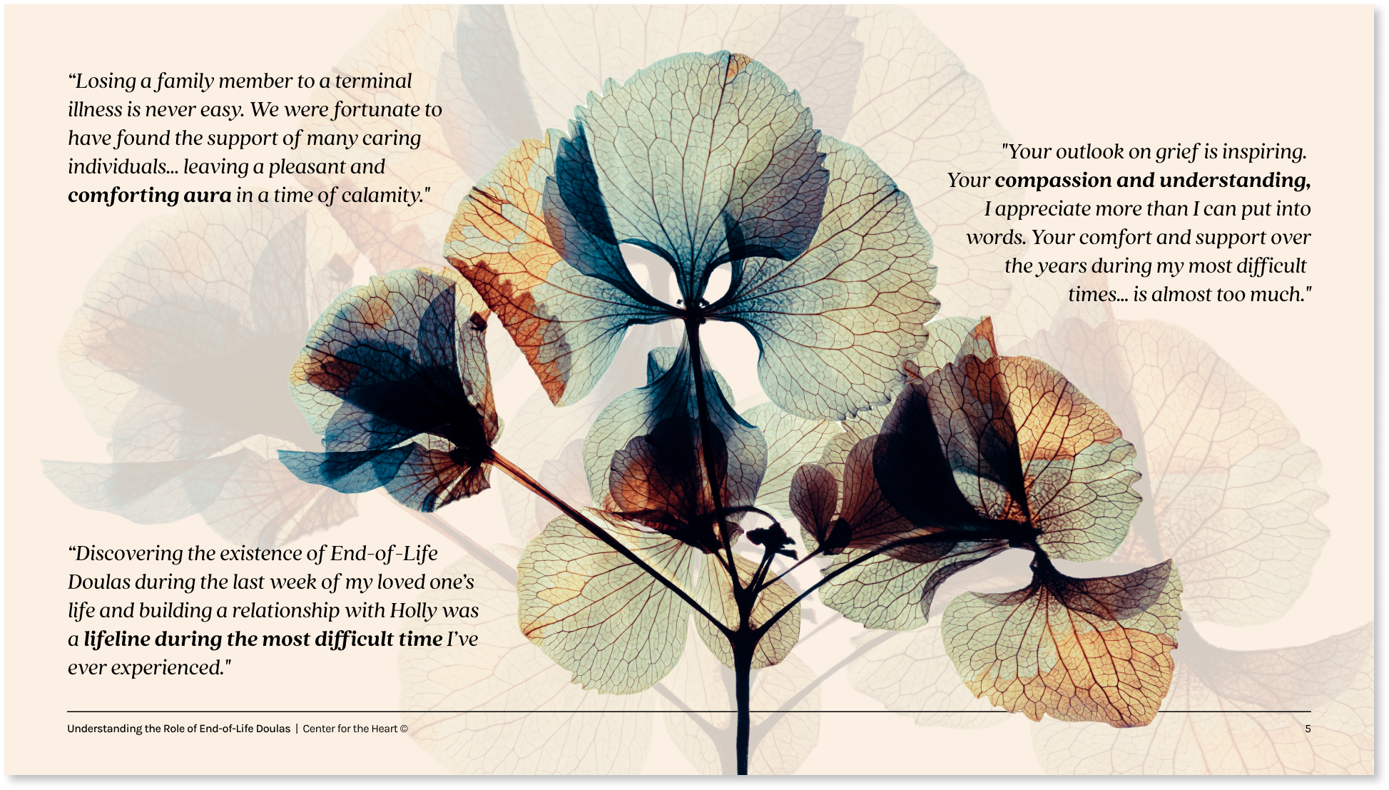
Pressed flowers symbolize both the transience of life and the enduring beauty that transcends death itself.

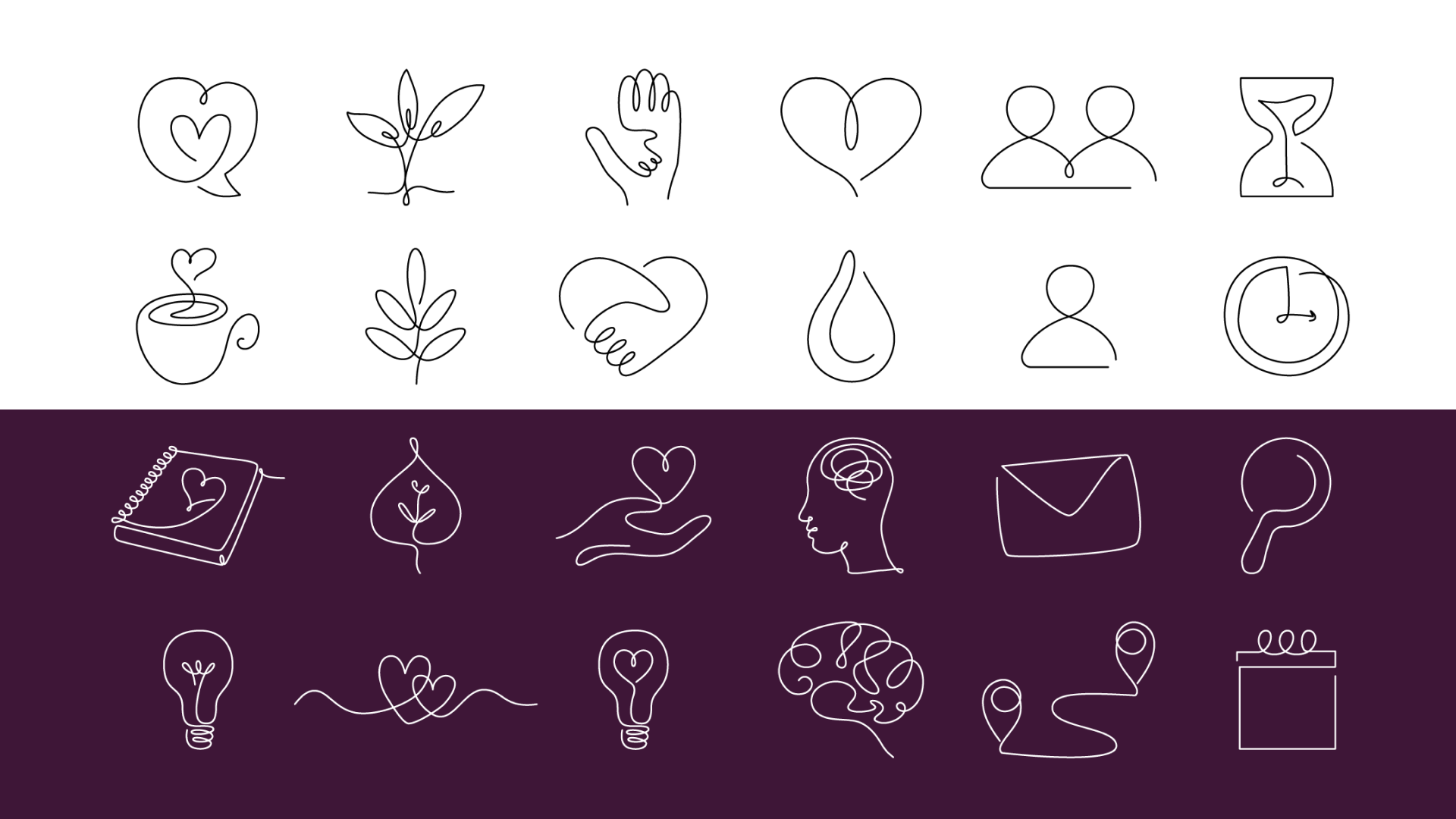
Graphic elements in a hand-drawn style used sparingly creates a friendly feel without looking childish.
Results
Brand in Action
Other Projects
